More than Words


More than Words
16 May - 16 June 2012
MORE THAN WORDS
Text – script – font – language – writing – prose – poetry – expression
Sara J Beazley – Jeremy May - Maria Noel – Francisca Prieto – Priscilla Purcell – Matthew Rose – Patricia Swannell – Thurle Wright
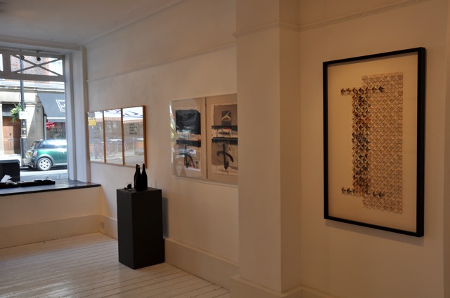
To celebrate two hundred years since the birth of Charles Dickens in February 1812 as well as the birth of Edward Lear in May the same year, More Than Words explores the relationship with words and art. This exhibition shows work by eight artists whose practice responds to different aspects of language and expression.
Sara J Beazley adopts motifs from vintage postcards, calligraphy and postage stamps found in antique markets in Asia and Europe. ‘Found’ phrases and images are united in these elegant prints, recapturing a historical setting with a contemporary sensibility. Sara combines heritage colours with brighter tones and creamy whites. Racing green is overlaid with vivid yellow or a flamboyant pink; marrying old with new, she employs traditional printing techniques such as etching, drypoint, embossing and silkscreen printing to produce contemporary and original images. Sara has created a new series of prints to celebrate the Queen's Diamond Jubilee, the Olympics and the Paralympics, drawing inspiration from London’s iconic landmarks in her signature style; this series of prints could be read as a postcard written to London itself.
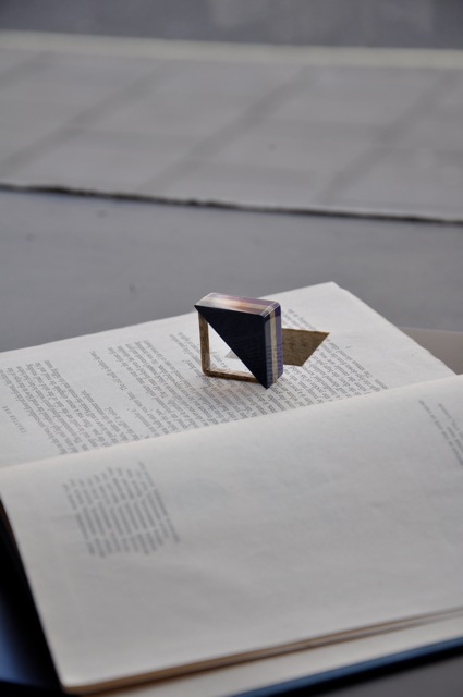
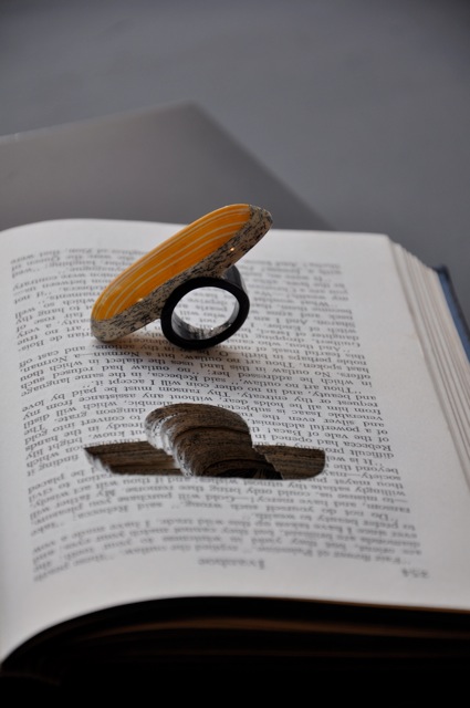
Jeremy May transforms reclaimed books into unique pieces of jewellery carefully cut from the pages of the book. The layers of text and images are visible through the lacquered surface of each piece, which is painted and polished before being returned to the space in the book from whence it came. Jeremy trawls through book markets on his travels to foreign countries; each book chosen has a history; it was bought, read, written on, sold on or given as a gift. In time, it was passed on to a street vendor, a second hand book shop, or offered to Jeremy. Often geometric in shape, the form and colour of each piece is inspired by a specific quote from each respective book. The text of Ivanhoe or For Whom the Bell Tolls is buried within each unique piece of jewellery, only exposed at the surfaces, revealing a tantalising glimpse of the writer’s story.
Maria Noel‘s paintings and works on paper are very much influenced by literature. For More than words, she has created a lithograph and collage which is inspired by the work of avant-garde composer John Cage, born one hundred years ago in 1912. The composition of the collage reflects the conceptual nature of Cage’s compositions, which includes 4’33”, four minutes and thirty three of a pianist not playing the piano. When one listens to this piece it is not silence that the audience hears; the sound of an electric light or a person’s breathing becomes more prevalent; the audience hears more than music. Born in Buenos Aires, María studied Fine Art and Philosophy and Art History, a tireless traveller through East and West.
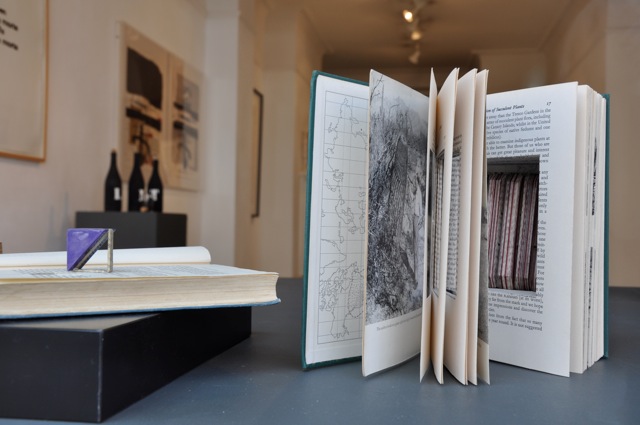
Francisca Prieto salvages rare, but damaged books and gives them a new life in her artworks. The pieces in the series Between the Folds are created so that the viewer can see all of the pages of the book at once, yet one can not read the book conventionally. Francisca folds each page to frame the images from the book, thus creating her own visual narratives between each carefully selected image. For More than words, Francisca has created a piece using a book on medieval illuminated manuscripts, which includes decorated initials, borders and miniature illustrations. The fine hand-coloured etched or lithographed plates have been arranged to emphasise their vivid colours and diversity. The piece has been worked as illuminated in itself as the letter ‘I’ stands as a decorated initial.
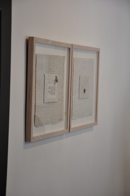
Priscilla Purcell’s work explores the significance and meaning of the abstract signs and symbols used by different cultures to communicate. As part of an on going project based on correspondence, Priscilla has created envelopes and letters from handmade papers which she posts to herself from around the world. From these letters, Priscilla has created a series of letter based works for the exhibition, where in place of the addressee, is the source of her inspiration. Following her extensive travels in Japan, China and Korea, Priscilla has reinterpreted the postage stamps from these countries. These envelopes are based on the origami folded design where the letter is the envelope. In Babel, Priscilla has used a combination automatic writing and mirror writing to denote the Biblical subject. While in Let music be the food of love, Priscilla has written the Shakespeare’s sonnet across one edge of the envelope, over the score of her ancestor Henry Purcell.
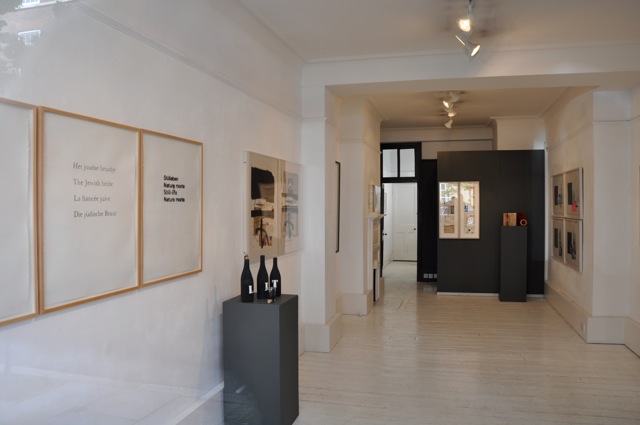
Matthew Rose has a varied practice including collage, printmaking and sculpture. In his Paintings series, Matthew explores the idea of word as image. He has created seven screen prints which describe in minimal terms, the subject of a great master painting. The works are summated by their respective titles, so that Rembrant’s masterpiece becomes simply the text Jewish Bride, written in Dutch, English, French and German, with the different connotations the phrase projects in the respective language. Delving into the plethora of art history, Matthew renders works by Giotto, Munch and Vermeer, similarly. In the collage series America, Matthew tell stories through a fragmented visual narrative. Matthew’s sources images from magazines, conveying a nostalgic, but surreal view of 1950s America, while the text on the collages brings a fresh element of humour through unexpected comparisons. An American artist, Matthew lives and works in Paris.
Following a commission at Wakehurst Place, Kew Gardens, highlighting the conservations work of Kew’s Millennium Seed Bank, Patricia Swannell has embarked upon a series of new drawings which portray the trees from Kew. Patricia’s writes, rather than draws portraits of these magnificent Golden Beach and Mana Ash trees by representing the rings of the trees to scale, repeating the name of the tree in English, Latin and their location at Kew. These words encircle a drawing of the seed of the tree itself, asking questions about growth, development and nature. The series Interval, relates to the time made manifest in the trees.
Thurle Wright creates works on paper, inspired by an interest in the systems and structures of language, in the ordering of knowledge, and in the storing and accessing of words. She transforms pages from books, atlases and newspapers and reconstructs them into structures and patterns, creating entirely new meanings. In The Craft of writing, the pages of the original book have been deconstructed into ribbons of individual sentences. These are aligned to re-imagine the open pages of a book; the words remain reassuringly intact, but the disordered sentences created a new nonsensical story. In Broken Routine, the pages from a Braille text are reconfigured into raise cones, emulating the three dimensional nature of the raised type. Through collage Thurle re-assembles text based source material and recreates it into unique and thoughtful pieces.